
![]()
![]()
![]()
![]()
![]()
![]()
![]()
![]()
![]()
![]()
![]()
![]()
![]()
![]()
![]()
![]()
![]()
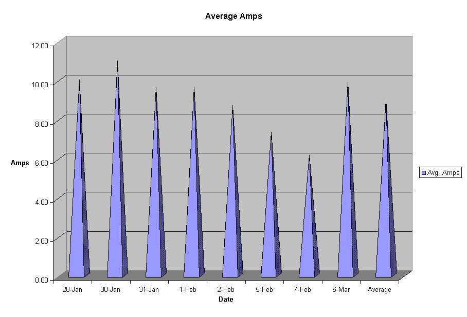
This graph is designed to show the proportional comparison between a high production day (such as January 30th, with about 11 average amps) and a low day (such as February 7th, with about 6) and an average (a little under 9 amps.) These proportions, though based on the old production spreadsheet should be similar for the new production data.
One other thing about the graph. In retrospect, it would be easier to understand, and therefore more useful, if the Y-axis was in amp-hours instead of amps. I intend to change this for the next version of the web site, but I regret I do not have the time to do so now. If you want to find how many amp-hours are represented here, multiply the amps by 10.5 hours.
Top Level: Home | Destinations | Cruising Info | Underwater | Boat Guests | Ocelot | Sue | Jon | Amanda | Chris | Site Map | Make a Comment
|
If our information is useful, you can help by making a donation |
Copyright © 2000‑ Contact: Jon and Sue Hacking -- HackingFamily.com, svOcelot.com. All rights reserved.